The Common Room
Unique heritage venue celebrating the region’s engineering history and inspiring the next generation
Unique heritage venue celebrating the region’s engineering history and inspiring the next generation
Year completed
2019
Project length
6 months (and support)
Working with
Services
Results
- Website launched to support building opening
- Additional functionality designed and built in over time
- Support for over 6 years
Website
Overview
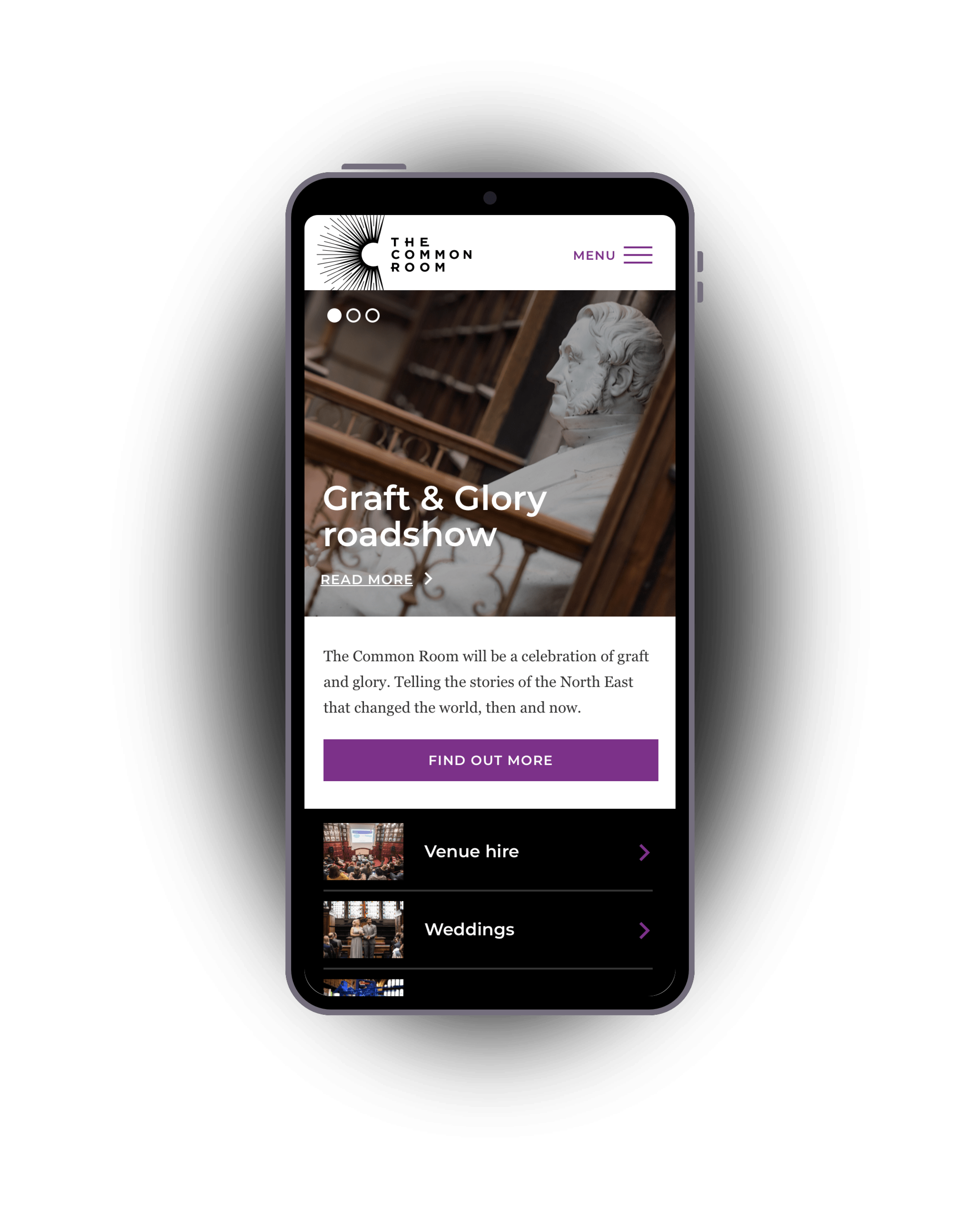
The Common Room is a unique heritage venue in the centre of Newcastle, available to hire for events and an archive for everything mining in the north. The building will celebrate the region’s engineering history through education and engagement, with a vision to inspire the next generation of innovators and engineers.
Working with the talented folks at Ammba Digital I was brought on the team to create the website, from concept, design, build and eventually support.
The brand was created by TwentySeven and whilst we weren't able to work with them direclty, we designed a site that was consistent with their guidelines, but also influenced by their initial print work, with a mix of B&W and vibrant colours and half-tone styled imagery.
Project images
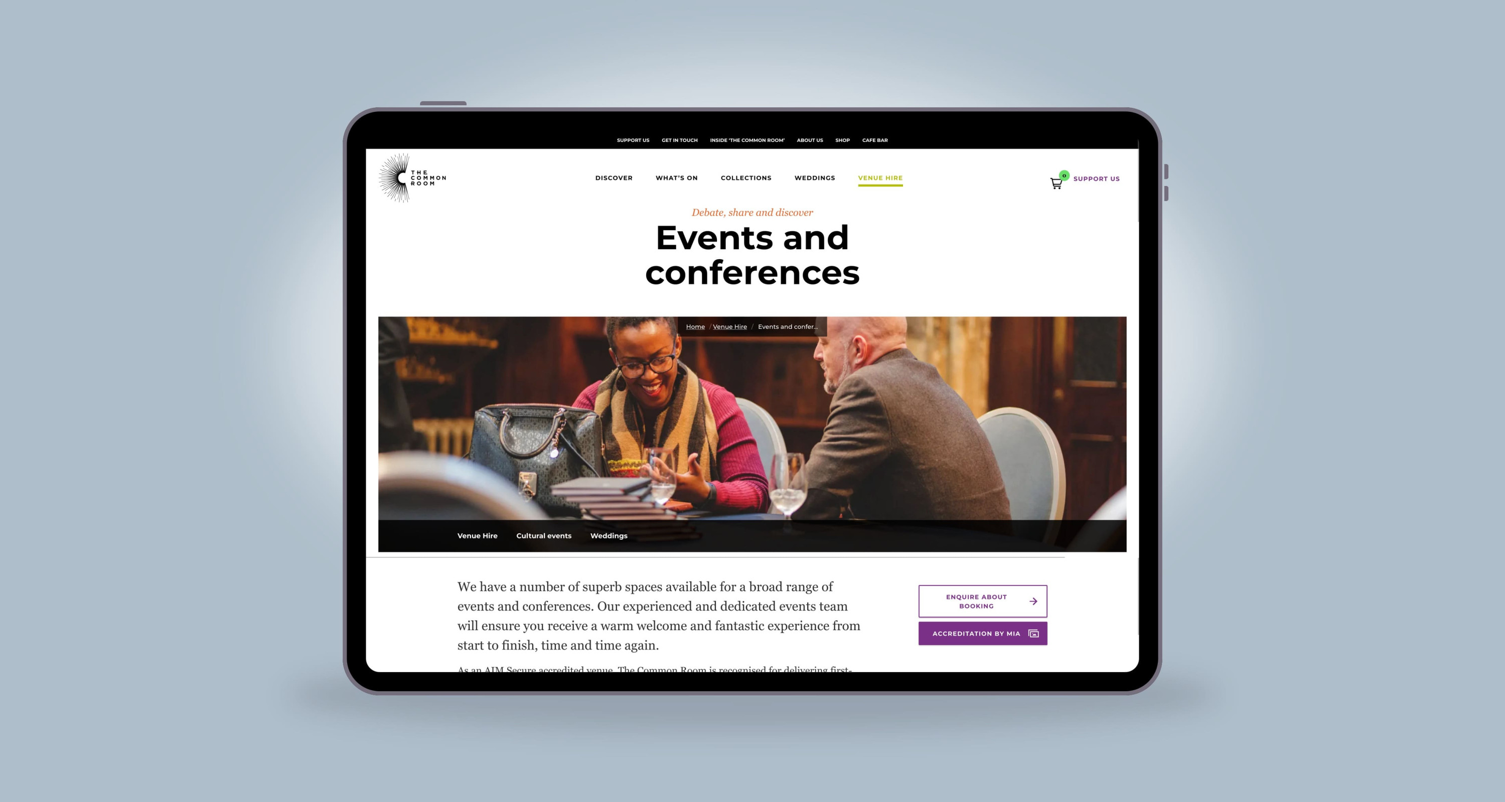
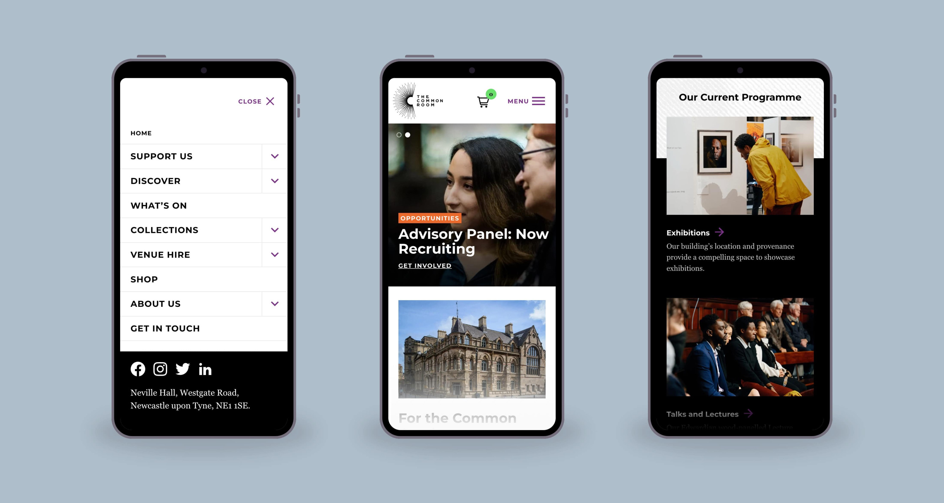
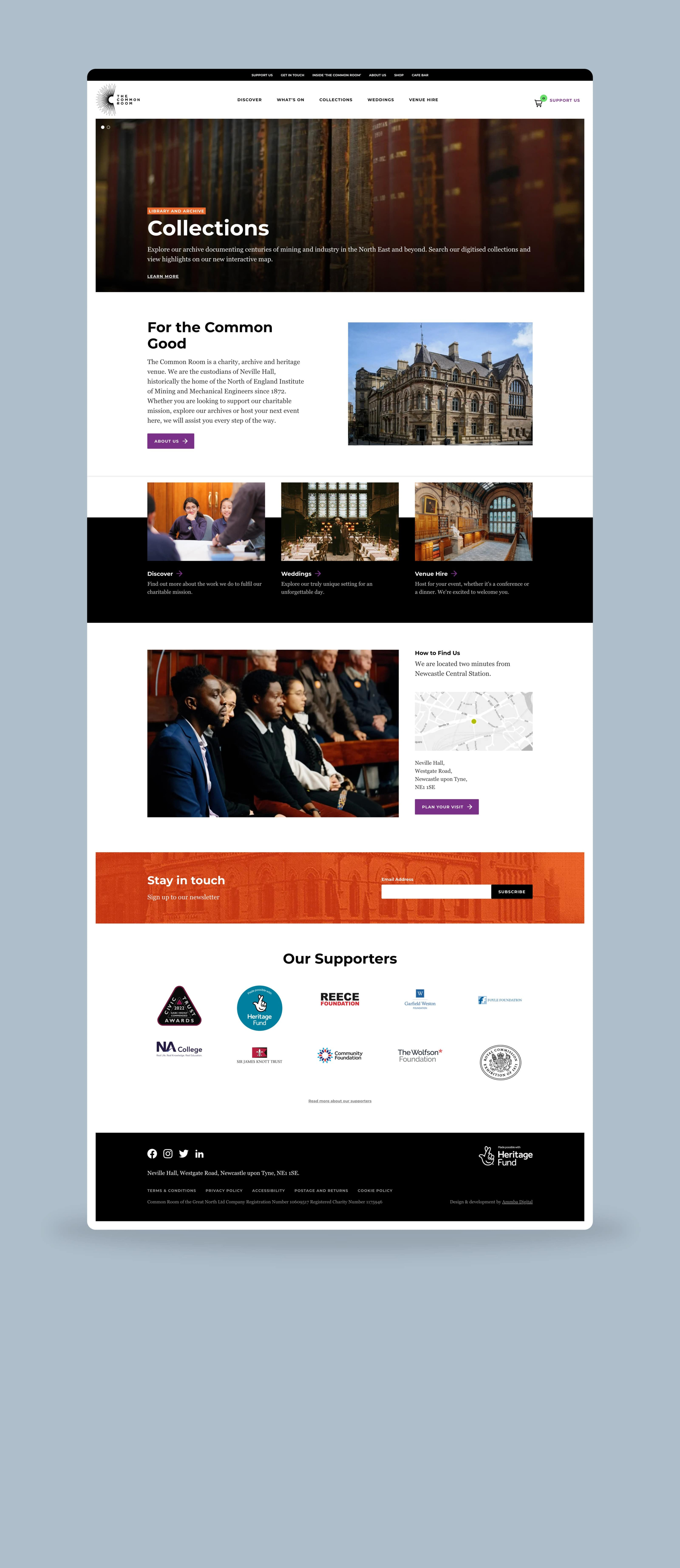
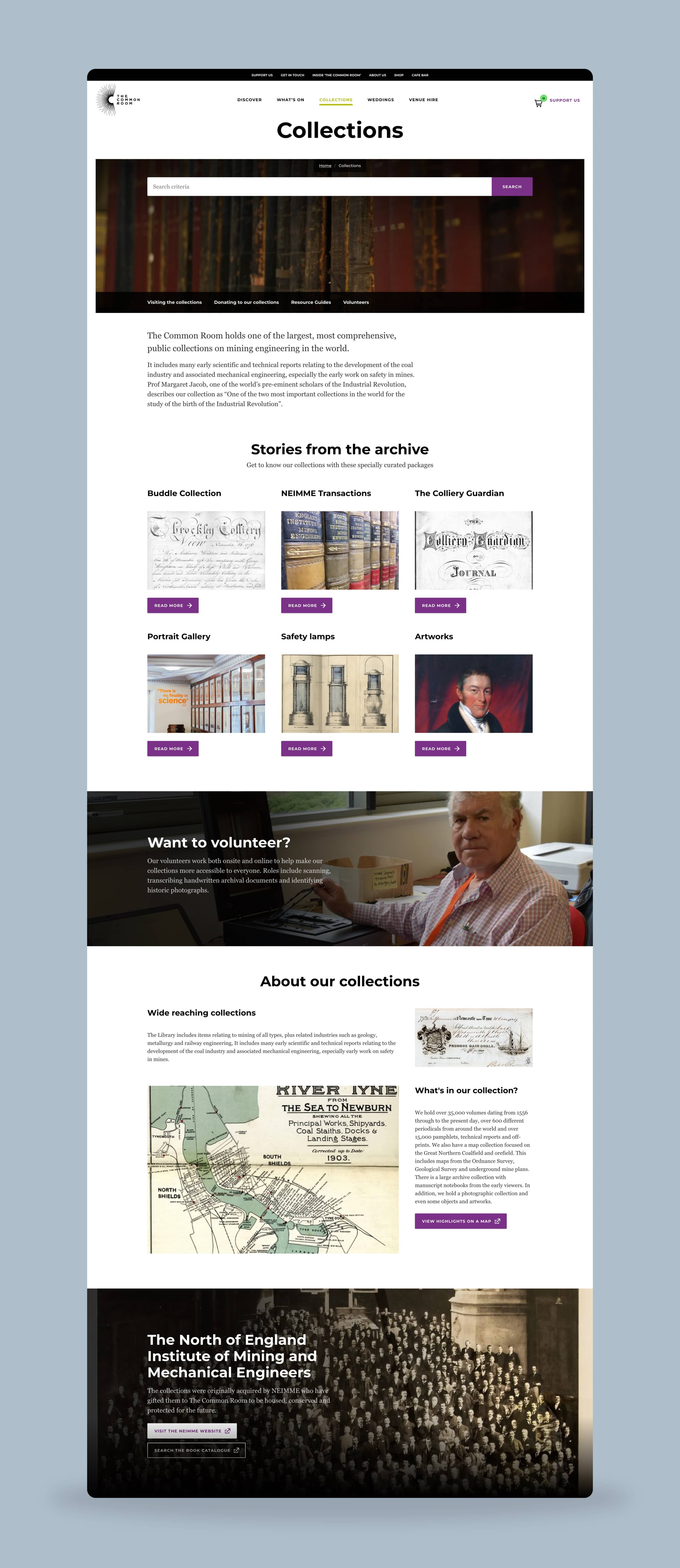
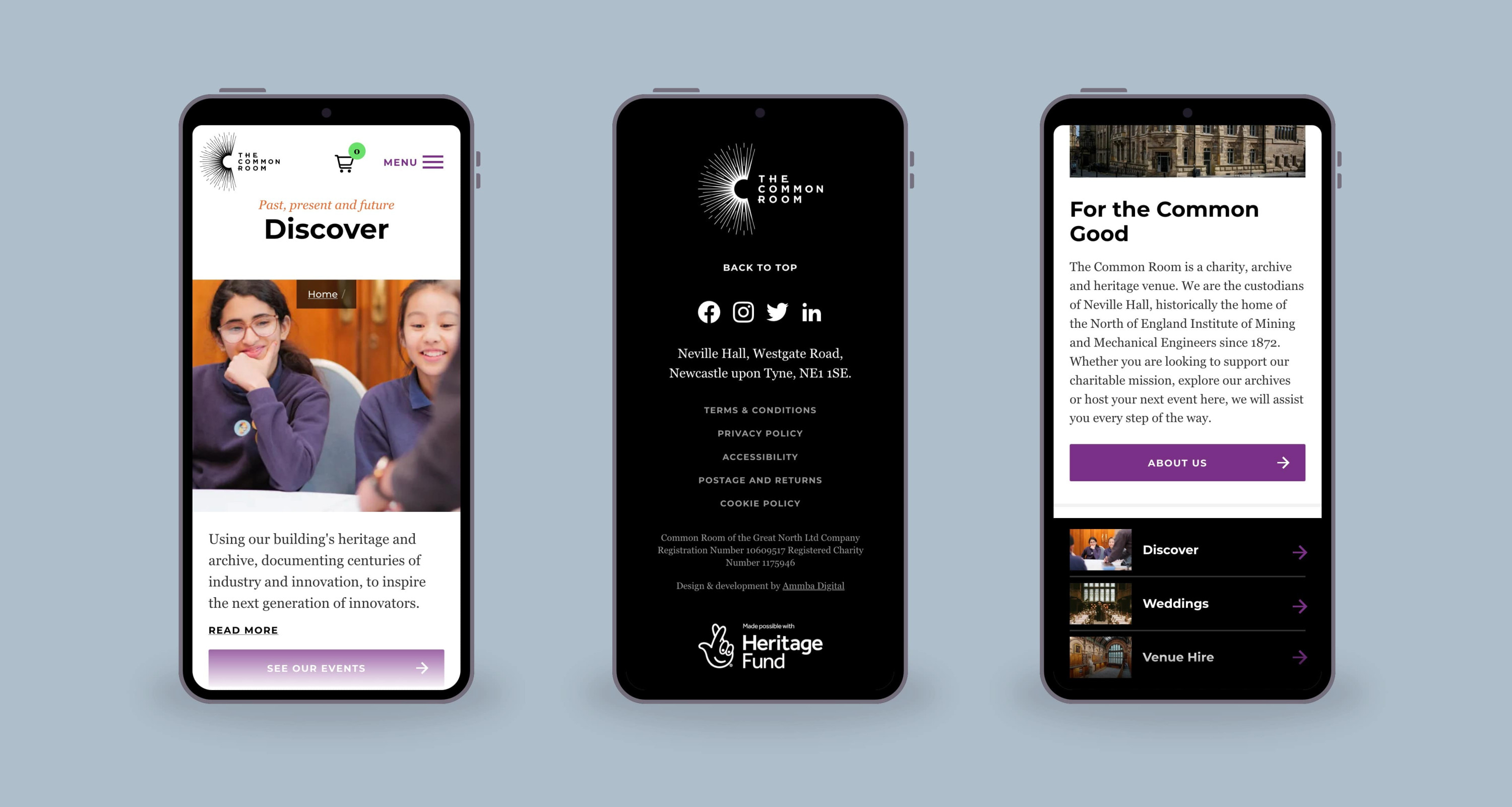
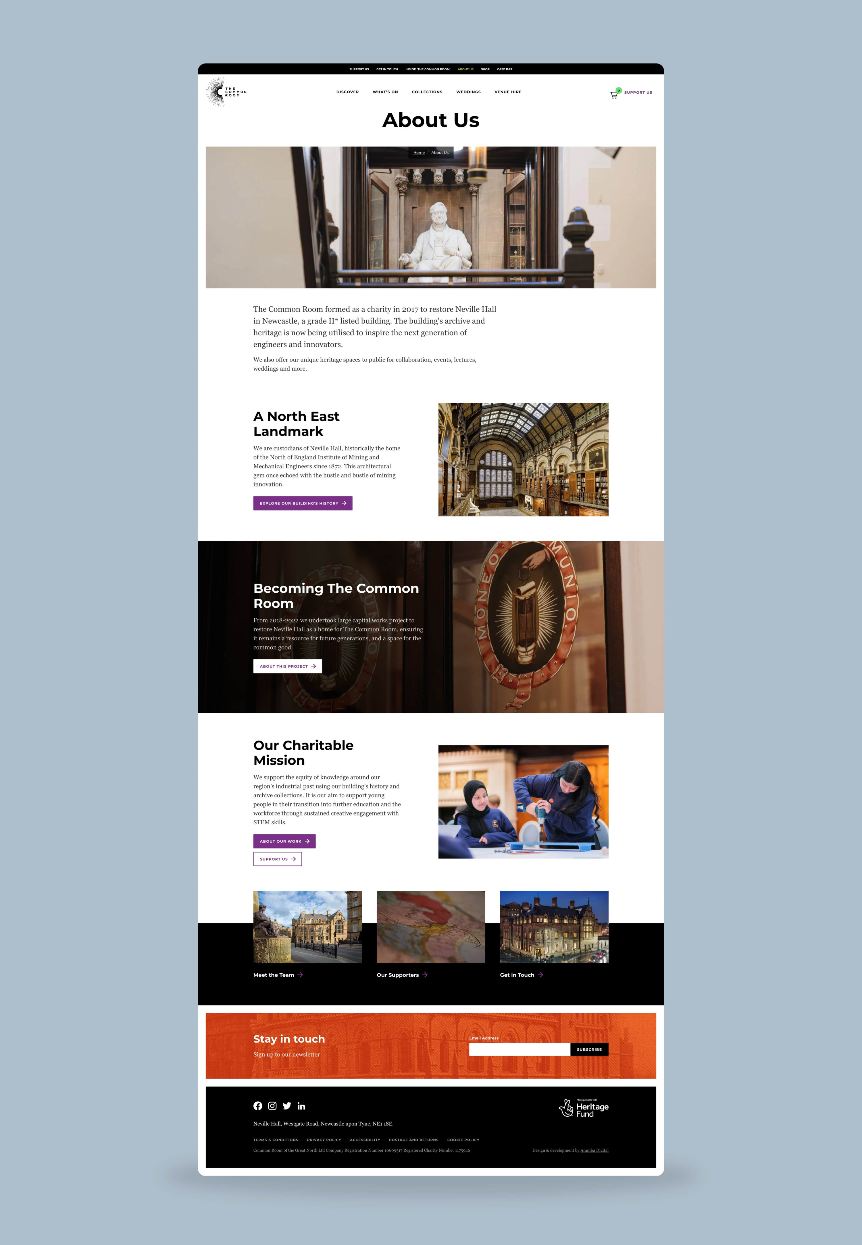
As part of our continued support of the team and website, we helped re-design and develop the navigation of the site as it grew beyond what they'd initially imagined for the near-future.
The 2 concepts below showcase alternative routes that also aim to push the visual direction of the site further.
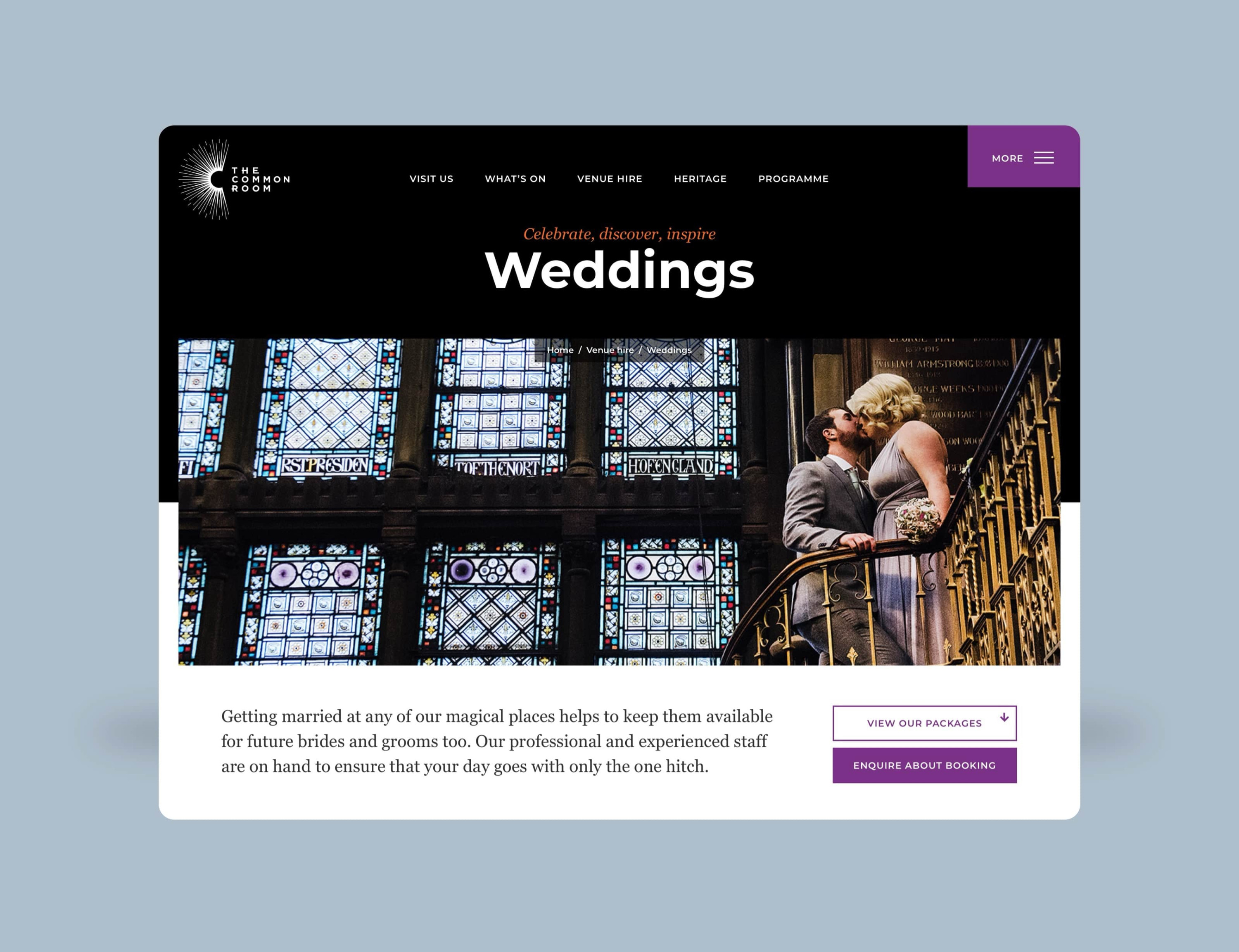
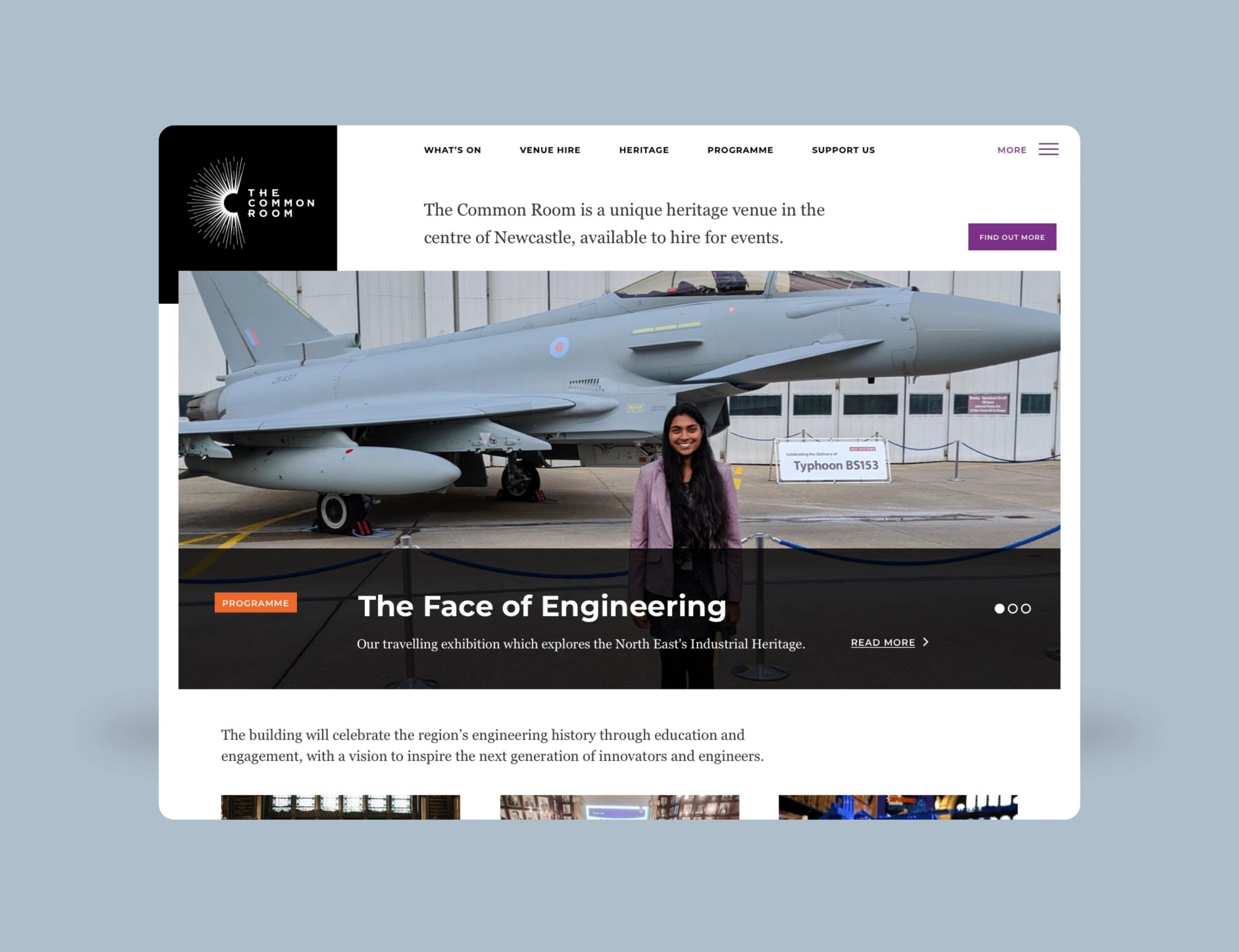
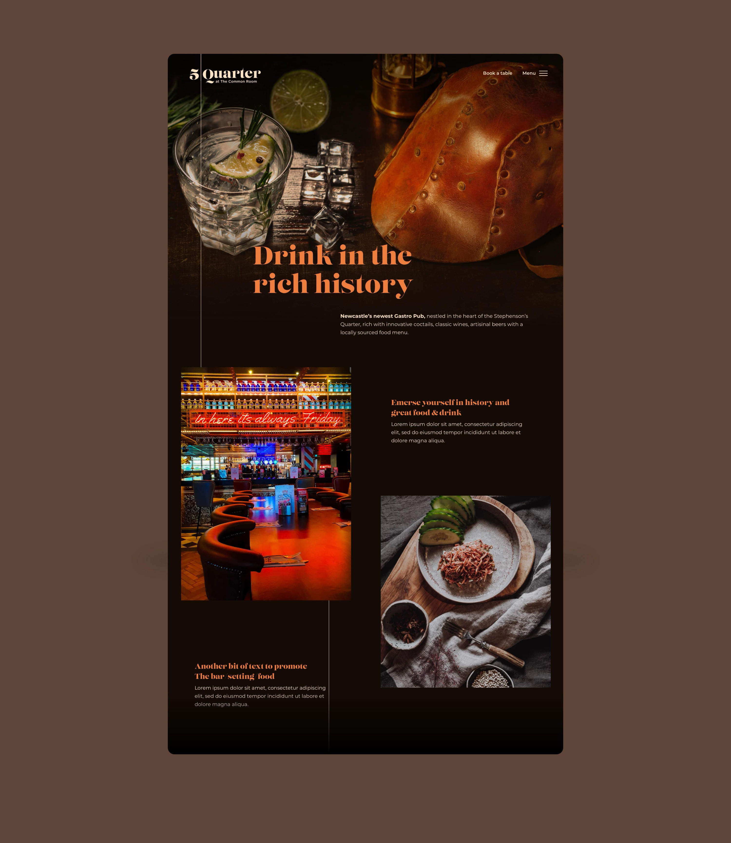
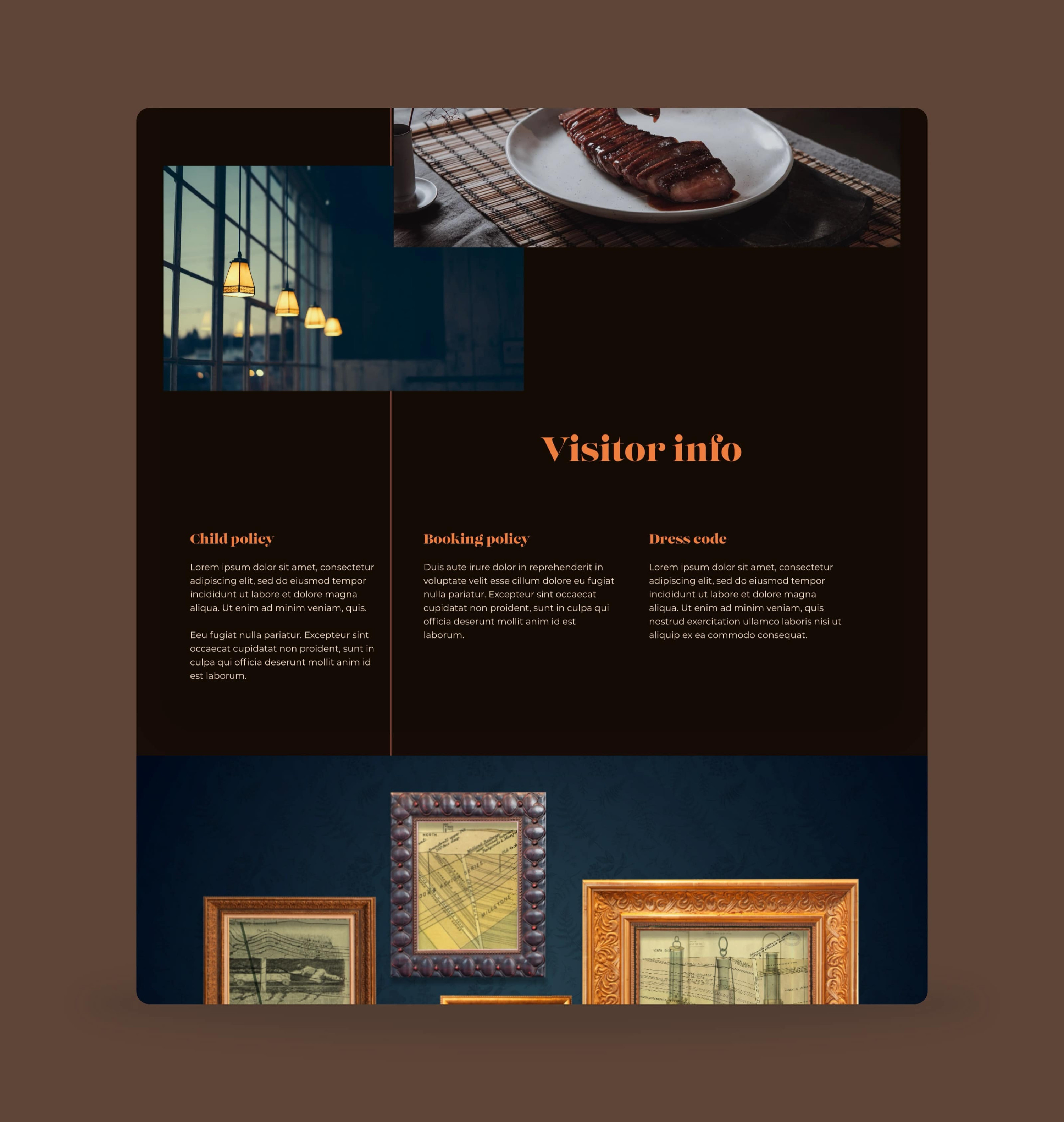
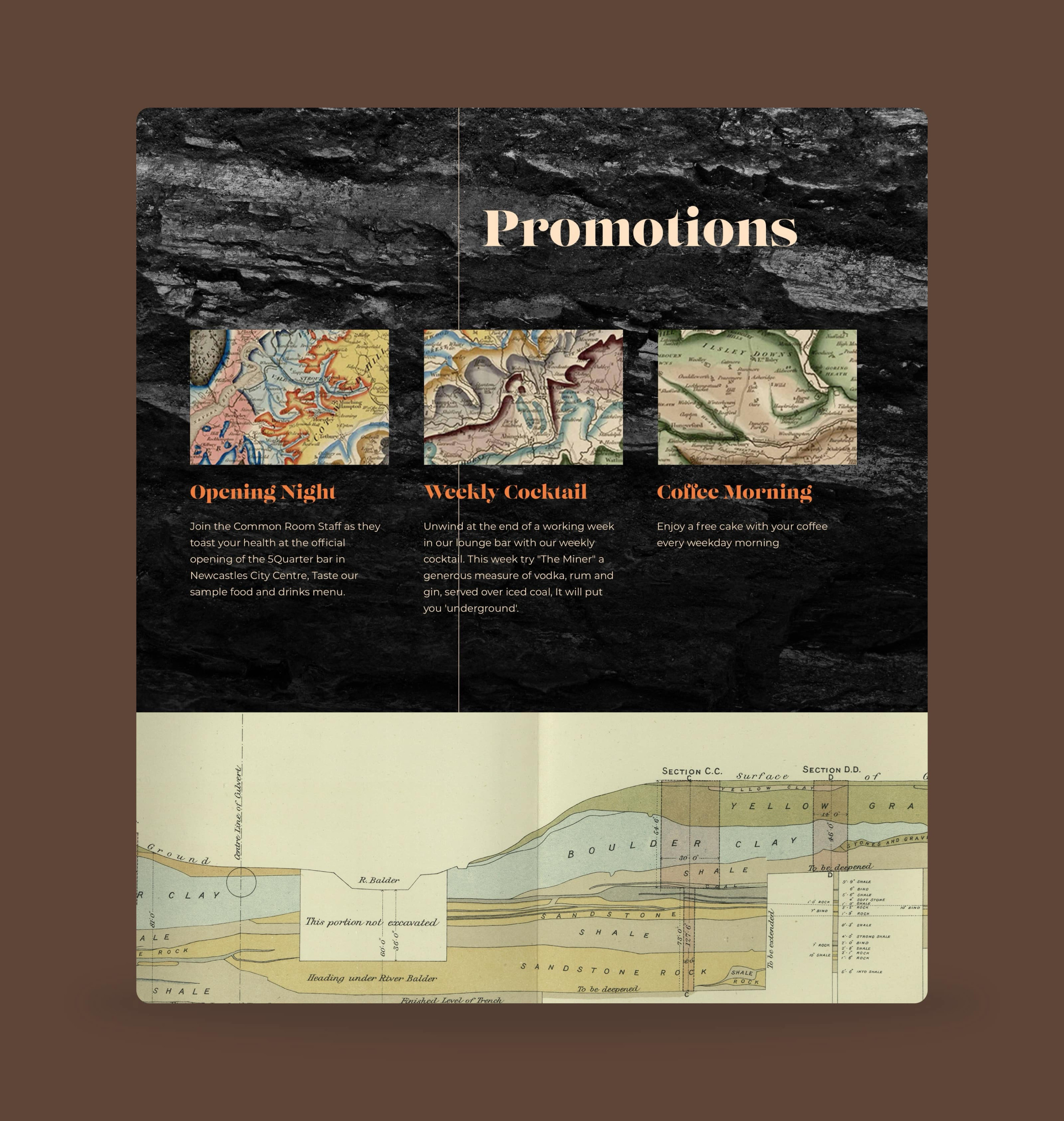
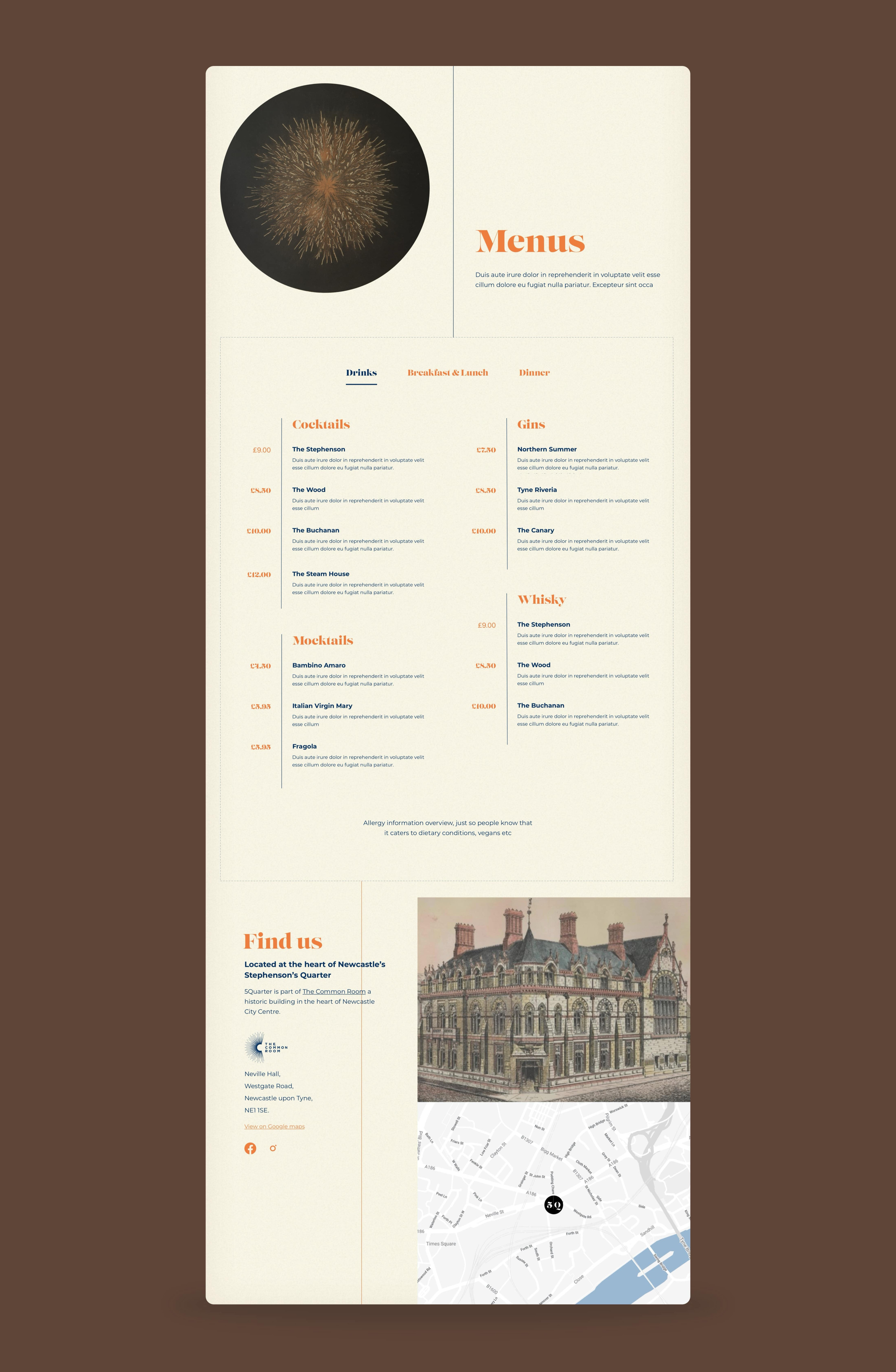
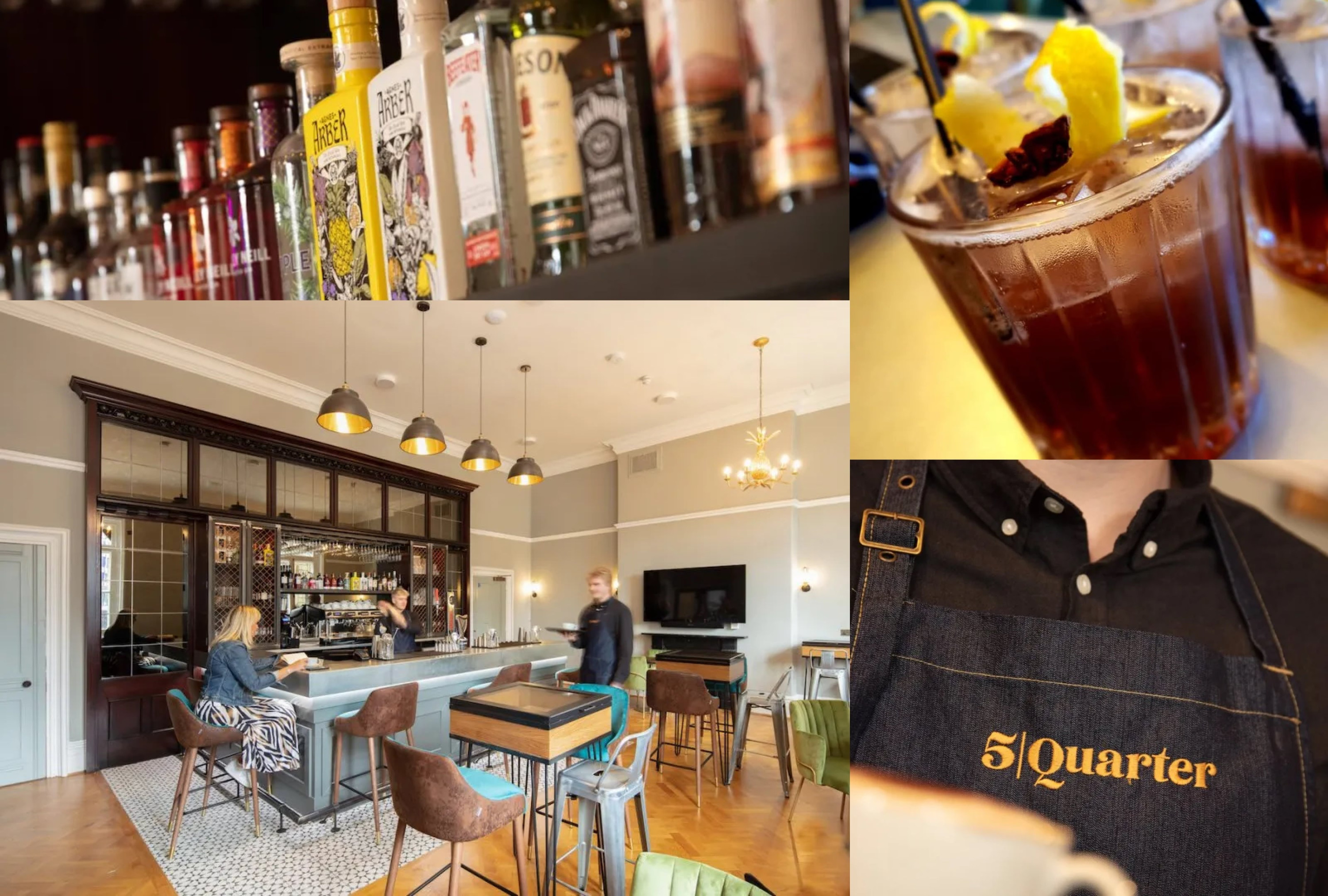
5Quarter Cafe & bar
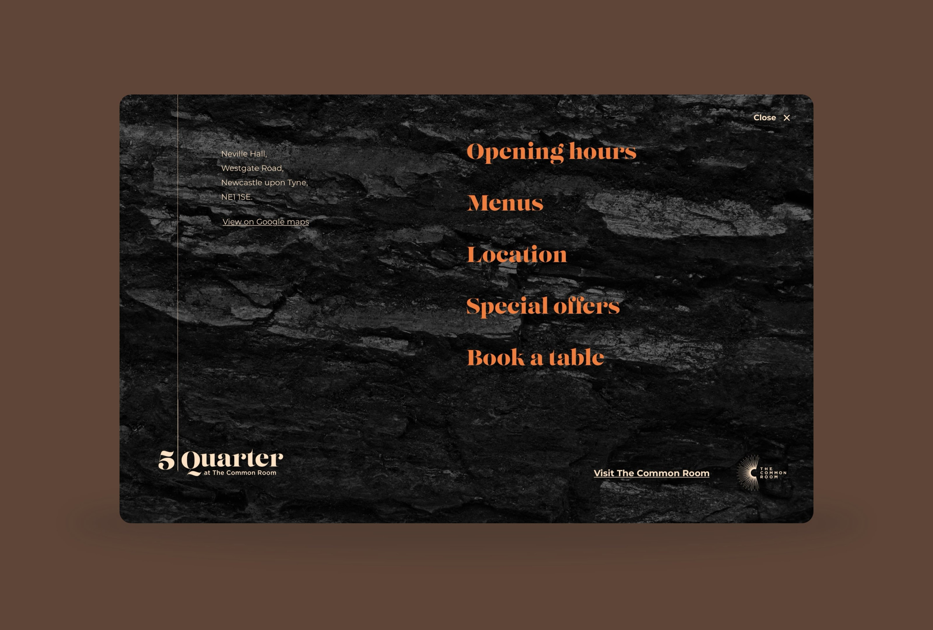
An addition 3 years into the website's life was the addition of a micro-site to showcase their newly fitted out and launched Cafe/Bar. The brand was again created by [TwentySeven](https://www.twentysevendesign.co.uk/), with them proposing the name 5|Quarter, which was inspired by one of the largest coal seams in the Great Northern Coalfield.
The one-pager micro-site featured all the information the venue needed to communicate, whilst also being very visual, and consistent with the brand and assets the team at TwentySeven had created. One idea is the '5 Quarter' line running down the website, moving horizontally then continuing down.
